Tesla UI: Just a tap away.
Reimagining the Tesla User Interface
by
Bill Carter
Climate, Launch Pad & Suspension.
While navigating a device, how many steps does it take to find something? I think it makes sense to strive for a UI design where everything you want to do is just a tap away. Especially in a car, where it is safer to quickly find what you need.
With software updates, the goal is to have the user experience get better over time, refining what is good about it while making it more functional, intuitive and fun to interact with. I followed these principles while reimagining parts of the Tesla UI for Model S/X. These refinements are based on the classic UI design with the half, and full screen app panels of previous versions. A brilliantly simple and customizable feature that allowed you to create your own personalized center screen displays.
Climate

My first goal was to bring some functionality and life back into the bottom bar of v9. The use of vivid color adds important visual cues to the functionality of a button, making the current state of a control easier to see, at a glance. Color can also be more visually appealing than the common black & white and muted color designs of late. There are few functional benefits of just using grayscale and muted color in a user interface, and they can actually make things more difficult to use.
I preferred the usability of the dual temperature controls, and having to change it from one to two is cumbersome. In this design, the SOLO button toggles with SYNC, making individual temperatures easier to set.
Passenger Volume controls show both a number of the volume level (optional) and a changing graph with 11 bars.
I added two new buttons, Headlights and Dome Lights. These give quick control over turning headlights off and on when parked and all interior dome lights can be turned off and on at any time. They can also toggle between headlights/parking lights/off and the dome light can have two brightness levels low/high/off. These buttons would not change the default auto or manual settings.
Similar to v8, the seat heater clearly turns red when on and includes the easier to see numbers that show heat levels at quick glance. Having the red seat icon is a good visual reminder that it is on. I have left the seat heaters on in v9 because the seat icon stays white and it is hard to see the small and muted color of the indicator. The Rear Defroster button was redesigned with the same horizontal lines that you would see on the rear glass. Another visual clue to it's functionality.
Finding the rest of the climate controls was never easy. I set out to fix that. So now when you tap the MORE snowflake, a single panel slides up with ALL the remaining climate controls visible....
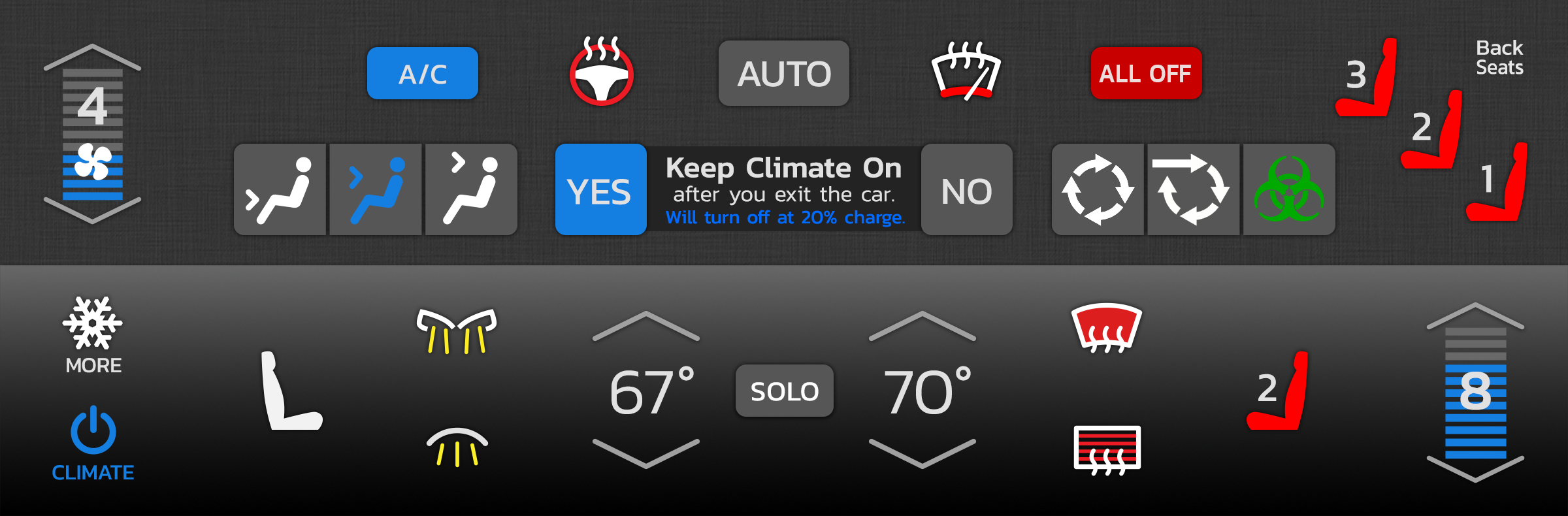
The "Keep Climate On" controls were simplified. The Back Seat heat controls look and function just like the ones for the Front Seats. And the Fan Control follows the design of the Volume Control.
This was all designed with ease of use in mind, putting all climate controls in one place and offering a quick "just a tap away" user interface. Tapping MORE again, or on any empty space closes the panel.
Launch Pad
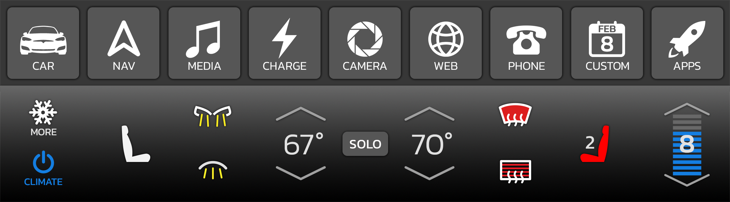
The Launch Pad is a 9 button pad where all settings, apps and games are launched. It sits above the bottom controls. By moving Launch Pad to the bottom, one of the things I considered was reachability. Buttons are easier to tap at the bottom. It also gives Navigation more room at the top. Having this launcher visible also makes apps just a single tap away.
A single button tap brings up a half panel, a double tap brings up full screen (if supported). A swipe up on an icon will toss the app to the top. I also like the idea of keeping a quarter panel media player option.
Tapping the APPS button will slide up an expandable panel to launch all additional apps and games. The CUSTOM button is where the last used additional app will be or it can customized with the additional app or game of your choice.
Suspension
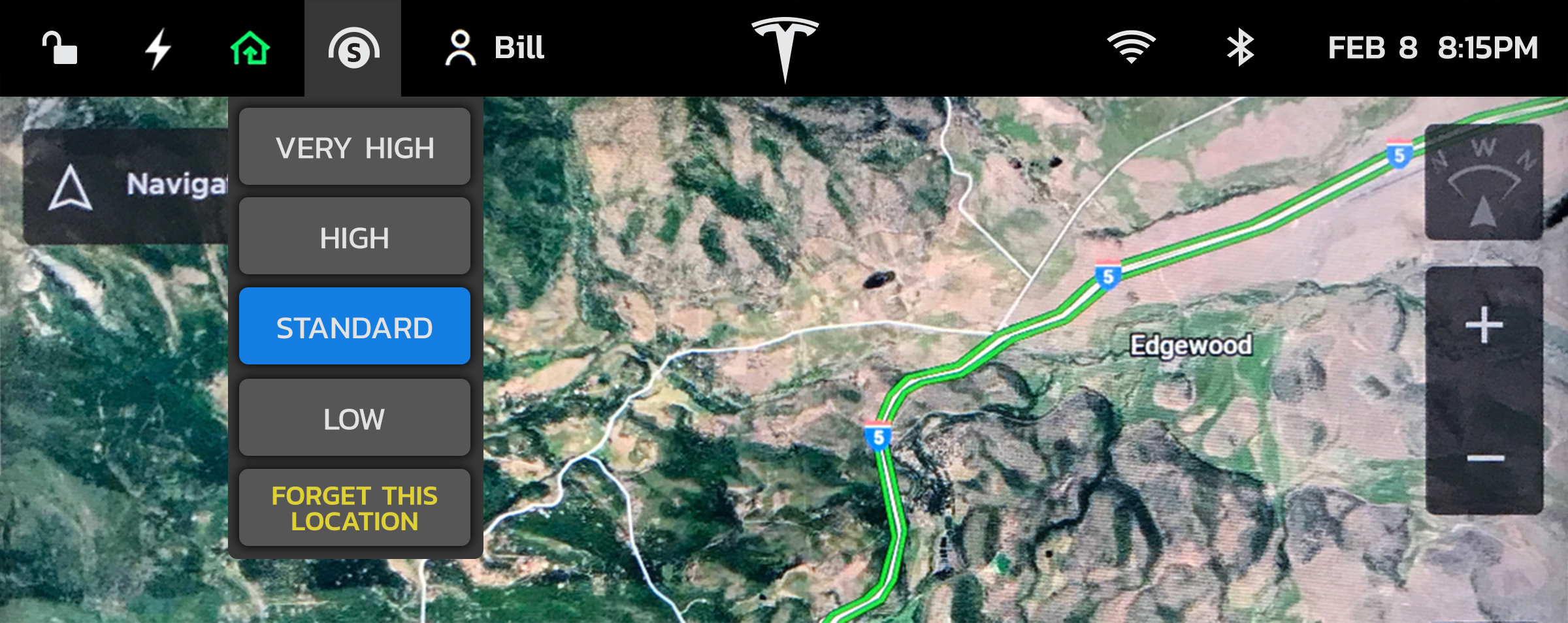
When I am driving down the road, quite often I get a notice that my suspension is changing due to a past location setting. At that point, the only way to see what changed is to tap the Car icon, and then tap the Suspension setting. Too many taps while driving.
I thought it would be great to always see what the ride height is, so I designed a new Suspension icon and quick menu. With this added icon we can now, at a glance, see the ride height setting, marked with a V, H, S, or L, and with a single tap, change it, or easily remove the current remembered location. Tapping "Forget This Location" will remove the last location change and restore ride height to what it was before the change. This menu can also auto-present itself when a past location changes ride height.
A quick thought about the top bar. It is easier to see when its background is solid black. Icons on top of the map without this bar makes them harder to see. Gaining that extra half inch for the map takes more away from the icon visibility than it benefits the maps. I added a date next to the time, and made the Tesla T larger.
Thoughts on Version 9
Imagine one night you are doing a software update on your Tesla Model S. The next morning you come out to your garage and find a Model 3 as the update. This is about how I felt after upgrading to version 9.
I’m not saying that the Model 3 isn’t a wonderful automobile, it just wasn’t what I purchased. I am very impressed with Navigation on Autopilot which takes self-driving on a Tesla to the next level. This is a great new added feature.
But, removing features from a car after purchase just doesn't seem right. For example, the full screen, and half screen views were a great feature that had been a popular part of the Tesla UI from the beginning. They allowed you to customize the center display with the items that you want to see, depending on what you are doing at the time. It was one of the key features I loved that influenced my decision to buy a Model S over a Model 3.
There was an elegance in designing these half and full screen panels to fit neatly into the center display. They are a kind of canvas for designing beautiful and functional apps inside of, allowing the driver to create their own experience in their car.
I do not need to or want to see a map all the time. It can be distracting and not visually appealing for bits of the map to always be showing in the perimeter. The sliding of the panels up and down, and the map moving along with them is unpredictable in action and causes a bit of motion nausea. With version 8, we could set up the center screen to see just what we wanted to see, filling the whole screen with something if we wanted to.
The sound system on my Model S is the best sound system I have ever owned, and the best way to experience it is with USB FLAC files, 16 bit and 24 bit. I loved displaying my albums at full screen, with their album art showing. It was a great way to pick some good tunes during a charging session. Version 9 removed that, both the full screen and the album art. The display count for Albums, Songs, Favorites, etc. has also been removed. It was useful and fun seeing how many songs/albums I have in my car.
Several of the apps and settings in version 9 now take more taps to find and use. Selecting an important panel like the rear camera is now 2 taps away. It used to be one. More tabs have been added to some settings, requiring more taps.
When a new product is introduced, like an iPhone or a Tesla Model, it establishes a certain set of features that makes the product unique. New features can be added to these products with software updates, and its base feature set can be improved upon, making them more functional and easier to use.
If there can be one rule of software updates, it should be to never remove useful features that makes the product less capable than it was before. If it can’t noticeably improve upon what was removed, then it should not be changed. This just degrades the original product feature set and causes frustration to the user. This seems so logical to me, but this still happens way to often with product updates. An "update" that creates more steps to achieve the same goal is a step backwards. An "update" that removes useful features and functionality is just not right, especially in a car that you originally purchased because of a certain set of features it had to begin with.